Lesson
UC10154 -- Exploring digital heritage -- Week 1
Draft, 09 August 2016
This page should be in a useful state, but still needs work before it's finished.
Introduction
Play time

I like to start off with a quick round of Headline Roulette both because it’s fun (I hope) and because it gets us thinking about different ways we might use and explore cultural heritage data. In this case, Headline Roulette is drawing information about digitised newspaper articles from the Trove API. Instead of your typical search interface we have a simple game.
What’s an API? An API (Application Programming Interface) is a way for machines or programs to talk to each other in a language they both understand. In the case of the Trove API, a script like Headline Roulette makes a request and gets back collection data in a nice structured form that it can do something with. Web sites deliver information to humans, APIs do the same for machines.
APIs help turn cultural heritage collections into platforms that we can build upon.
What this unit is about?
- This unit explores how digital tools and techniques can be used to extend our understanding of cultural heritage theory and practice.
- Instead of just talking about the possibilities of the digital, we’ll be making, playing, hacking, and building. This unit isn’t going to turn you into a coder, but it will give you a strong sense of what’s possible.
- We’ll be touching on a broad range of technologies, hopefully giving you the skills and confidence to explore further in the future.
What’s expected of you?
- To benefit from this unit you need to participate, either on-campus, or online (or both).
- There won’t be any lectures. Instead, I’ll work with you each week to complete a set of activities.
- You can either attend the weekly on-campus workshops or undertake the activities in your own time with online support.
- A small number of readings or videos will be assigned each week to provide important background information. You’re expected to read or watch these before undertaking the activities.
- As part of your assessment, you’ll be expected to write and share a short reflection on each week’s activities. See Assessment 1 on the Moodle site for more information. Note that these will be shared in public on the unit’s blog site. We’ll talk more about the blog and how you add to it in Week 2, so I’m not expecting you to post any reflections until then.
What’s expected of me?
- I’ll provide details of any relevant readings for the coming week by Monday of that week.
- I’ll document the activities and make them available online in time for the on-campus workshop (Wednesday, 1.30-4.30pm).
- I’ll be available to assist online students via Google Hangout on Thursday from 8.00-10.00pm. I’ll post the link on Slack and Moodle in advance.
- I’ll be available on-campus on Tuesday and Wednesday mornings (see Moodle for details).
- I’ll monitor Slack and Moodle for any additional questions or problems you might have.
Assessment
Full details of the three assessment items for this unit are on Moodle. In summary:
- Participation and reflection (20%): You’ll post weekly reflections on class activities to the unit blog by the end of each week.
- Project proposal (30%): You’ll develop a proposal for an online project that provides a new perspective on a cultural heritage site, collection, issue, or dataset.
- Project development (50%): You’ll design, build and deliver the online resource that you described in your project proposal. This isn’t intended as a test of technical ability – you’ll be able to complete this assessment using a variety of online tools that we’ll explore during our weekly workshops. You’ll also need to post a 1000 word reflection on your project to the unit blog.
Using Slack for communication and questions
Anyone who’s used Moodle knows that it can be difficult to have conversations or keep up to date with the latest information. To overcome some of these difficulties and provide an easy-to-use communication channel, we’ll be making use of Slack – a popular messaging platform for teams.

Slack is widely used in workplaces so, unlike Moodle, it’s a tool you might make use of in your future careers. It’s also more fun than Moodle.
To sign up, just go to:
https://uc10154.slack.com/signup
and use your uni.canberra.edu.au email address to register. The process is painless – just follow the instructions and you’ll be set up in minutes. Once you have your account you might want to download and install one of the Slack apps, so you can have easy access on all of your devices.
For more information see Slack’s Getting Started guide.
Annotate this!
Another handy tool you can make use of throughout the unit is Hypothes.is. Hypothes.is makes it easy to add notes and comments to any web page. Including this one – I’ve embedded Hypothes.is in this site.
Try selecting some text on this page – you should see an option to highlight or annotate. That’s Hypothes.is at work. To actually add an annotation you’ll need to set up a free account with Hypothes.is. There’s some more details on this page.
Why might this be useful? You can use it to add your own private notes to activities – to remind you of things to follow up, or important things to remember. If you come across something that I haven’t explained very well, you could add an annotation with a clarification or question. You can use Hypothes.is to make these pages better!
Try Hypothes.is and think about other uses within the cultural heritage sector. For example, here’s a recent blog post that talks about using it with historical sources. Perhaps your project for this unit could be an annotated historical text?
Digital survival skills
Learning to love the command line
Throughout this unit we’ll be trying out a lot of different tools. You’ll be creating accounts on lots of different websites, and sometimes you might even have to open up a terminal and type things on the command line.
Don’t know what I’m talking about? Before there were mice and menus, GUIs and touchscreens, one of the main ways of interacting with computers was by simply typing commands. Even now, there are some things you can only do on the command line. And it’s really not that scary.
I created a quick guide to help you open up a terminal and explore the possibilities of the command line.
Once you have a terminal open, work through this tutorial from the kind folks in the Scholars’ Lab at the University of Virginia.
What changes?
But this unit is not about making you masters of the command line. It’s about thinking through the possibilities and implications of digital technologies in the cultural heritage sector.
As a historian, I’m always suspicious when someone starts talking about ‘revolutions’, particularly with regard to technology. Yes there’s change, but there’s also continuity. For example, we have to remain critical of historical sources, whether or not they’re delivered in digital form. Simply because they’re conveniently delivered to our screens doesn’t make digitised documents more truthful or more reliable. We still have to ask questions.
What sort of questions might we ask? The digital historian, Adam Crymble, gives a glimpse of some possibilities in this two minute version of his PhD thesis:
Digital tools provide a way of dealing with the large volume of material that is now becoming available in digital form – of grappling with the challenges of abundance.
One example of this is a simple tool I created called QueryPic. QueryPic visualises searches in Trove’s newspapers zone. What happens when you search the more than 200 million articles available on Trove and get back 10,000 matching results, or 100,000 – how do you make sense of that? Instead of just providing a list of search results, QueryPic shows you the number of articles each year that match your query.
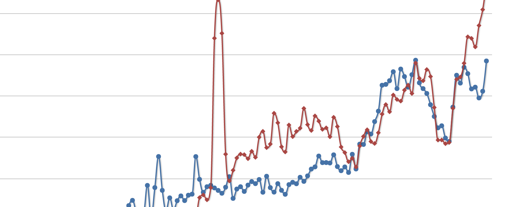
Just in case you’ve ever wondered what we should call the guy in the red suit who turns up at Christmas time, I’ve created a QueryPic for you – have a look at A Christmas Controversy.
This QueryPic displays the results of two searches – one for ‘Santa Claus’ and the other for ‘Father Christmas’. Drawing on that huge body of digitised text from 1803 to 1954, we can explore changes in language over time, or the impact of specific events.
Note that by default QueryPic shows the number of matching articles as a proportion of the total number of articles published that year. This makes it easier to see results in the earlier decades, when fewer newspapers were published. You can easily change this – just choose ‘number of articles’ from the dropdown box under ‘View’. You’ll then see the raw number of matches.
What do you notice about the battle between Santa Claus and Father Christmas? Which name was most commonly used in the 19th century? It seems that Father Christmas became more common in the First World War period. Why might that be?
Be careful. QueryPic provides more questions than answers. It’s a way of seeing those millions of newspaper articles differently, but we still have to think about what these visualisations are telling us. They’re sketches, not arguments.
You’re probably wondering what happened to Santa Claus in 1882. Using QueryPic you can drill down to explore what’s going on at any point.
Click on ‘Santa Claus’ peak in 1882. Like Headline Roulette, QueryPic talks to Trove using its API. When you click on a point, QueryPic fires off a query to the Trove API, asking for the first 20 results from that year. Hopefully, you should soon see a list of the results appear at the bottom of the page. (Sometimes the API fails and you have to try again.)
Have a look at the results – notice anything interesting? Without actually reading any of the articles you should be able to pick up enough clues to make an educated guess about why ‘Santa Claus’ was mentioned so often in 1882. [Hover for answer]
It’s easy to create your own QueryPics – just click on the Create tab and enter a few keywords. For more information see the help page. You can also explore QueryPics that others have created.
Tools like QueryPic help us to see things differently. But we have to be prepared to ask questions about the assumptions they make, about the biases that are built in to their algorithms. Our ability to work with vast quantities of digital data has changed, but the need to be critical remains.
The question of ‘What changes?’ when we start to use digital tools is one that I want you to keep in mind throughout this unit.
How did they do that?
Given what’s going on at the moment, I thought I should probably provide an Olympics example. So here we go – the history of the Olympics visualised courtesy of the New York Times. Scroll down the page and you’ll see breakdowns by sport.
It’s pretty easy to see historical trends, such as: the impact of politics through the two world wars and the boycotts of the 1980s; the increasing involvement of Asia; the continuing battle between Australia and Britain. It’s also interesting to look at the strengths of particular nations in individual sports.
Have a play around and see what you can find. Any surprises?
But of course the lovely curvy lines flowing through time are made up – Olympics only happen every 4 years. It’s also interesting to look at which countries are bundled together. Decisions have been made about what’s most important to display.
Do you know what these sorts of visualisations are called? They’re ‘streamgraphs’. Streamgraphs are useful ways of representing data that changes over time. Throughout this unit we’ll be looking at lots of different examples, thinking about what they can tell us, and how they were created. Just knowing what something is called can be a big help – try Googling ‘streamgraph’ and you’ll see a range of different tools and examples.
For one of her classes, Miriam Posner created a useful resource called How did they make that?. It lists a number of digital humanities projects and describes the tools and techniques used in their creation. The DH Commons Journal also includes a ‘How did they make that?’ section. As you start to think about your own digital projects you might want to bring examples you’ve found to class so that we can discuss how they were made.
Hacking the web
Let’s start with the web itself. Every web page is actually an assemblage of code, images, APIs, standards, and protocols which is magically brought together and assembled in your browser. Through the magic of Mozilla’s X-Ray Goggles you can actually peek inside the workings of the web and play around with the way pages look:
- Go to the X-Ray Goggles page
- You might as well create an account (this will let you save your projects) – so click on ‘Create an account’ at the top of the page and follow the instructions.
- Now follow the instructions to install X-Ray Goggles in your browser. It’s basically just a matter of dragging the pink button to your browser’s bookmarks bar.
- Once you’ve installed X-Ray Goggles, click on the ‘Sample activity page’ button and follow the instructions.
- Once you’ve activated X-Ray Goggles you can click on the elements of a web page to see the code underneath. Even better, you can edit the code to change the way the page looks. On the sample page you can mix and match images of some cute creatures.
Of course, you’re only changing the version of the web page that appears in your browser. But this is what browser extensions and userscripts do to customise our web experience. Instead of switching images of cute animals you might create an extension like Stop Tony Meow, which looks for images of Tony Abbott on webpages you load and replaces them with cute kittens.
Let’s take this a step further. Go the home page of the cultural heritage institution of your choice, such as:
- the National Library of Australia
- the National Museum of Australia
- the National Archives of Australia
Activate X-Ray Goggles. Now you’re in control – what do you want to see on their homepages? Change the text, swap the images – create your own version of their sites. Be creative! Be provocative!
Once you’ve hacked your site, save it using X-Ray Specs ‘publish’ option, and share the link on Slack.
Customising headline roulette
We began with Headline Roulette, but not only can you play it, you can customise it. I’ve created a DIY version that you can use to limit results to particular newspapers or searches.
The instructions are all available here. Have a go and share what you create!